Billea Breen | UX

Monster Design System

As the acting Design System Lead at Monster, I orchestrated strategic updates that harmonized the Design-to-Dev hand off process, achieving a practically perfect collaboration, sprinkled with a touch of enchantment.

 
Monster Design System Cover Page

Project Scope

To kickstart the process of updating our Design System, I led our team in conducting a comprehensive inventory of all the components in Storybook, Live on the Website, and Figma components. By visually grouping them together, we identified patterns, similarities, and , enabling us to define the scope of the update with clarity. This process provided a holistic view of the system and guided informed decision-making, as well as effective prioritization of efforts.

With the comprehensive inventory in hand, we delved into fruitful conversations with our Front end UI teams. I sought to understand how each component was built, distinguishing between elements governed by JSON and others that had old hard code running the show. This deep understanding proved to be the key that unlocked the magic of our Design System, fostering seamless collaboration and setting the stage for a unified and enchanting user experience across all platforms.

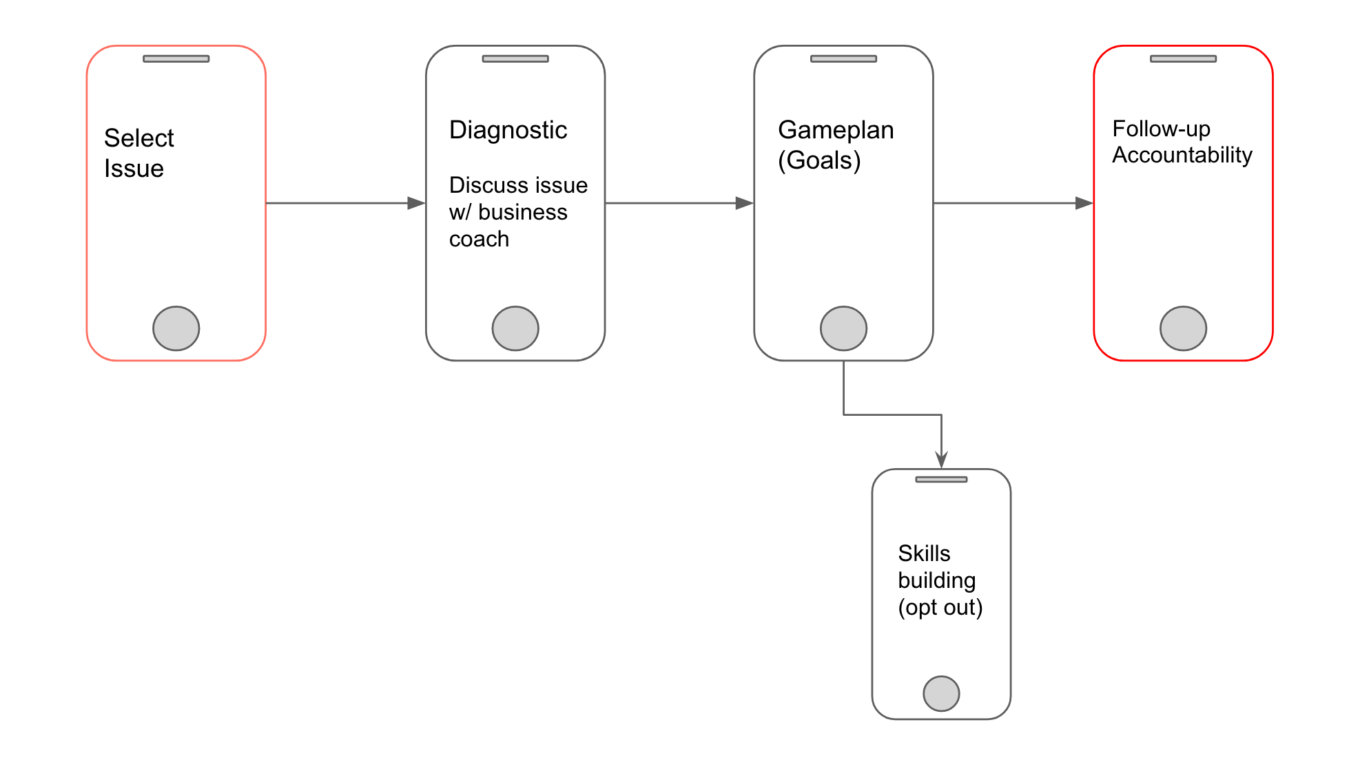
Good design is rooted in a deep understanding of the handoff process. I've experienced instances where designs undergo significant changes when transitioning from Figma to code. To preserve design integrity, I've learned that effective communication with developers is essential. By engaging in open dialogue and finding common ground, we can ensure a seamless and harmonious journey from concept to implementation.


Inventory

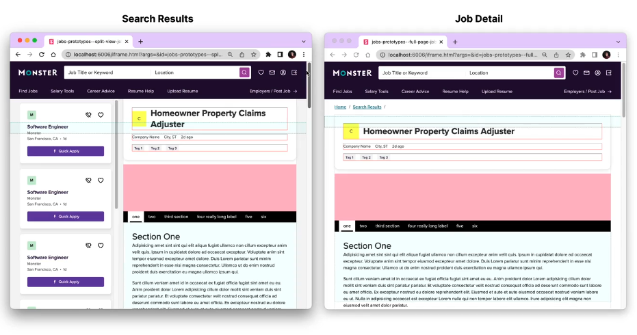
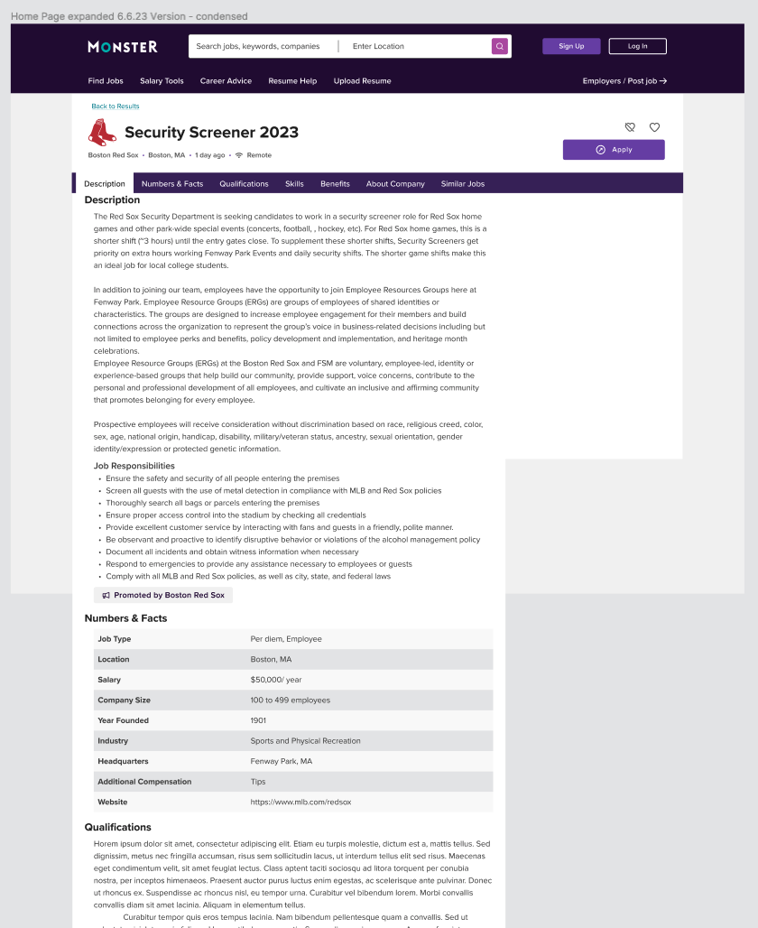
In the process of conducting a full website inventory, we crafted a detailed site map and divided the work. With FigJam, we recreated the collaborative feel of working together in a conference room, using virtual whiteboards to share screenshots and design concepts. We meticulously inspected hover states, keyboard focus, and code to grasp every detail. This digital teamwork brought us closer as a team and empowered us to enhance the user experience with precision and care.

We went section by section to keep organized.


Figma Inventory

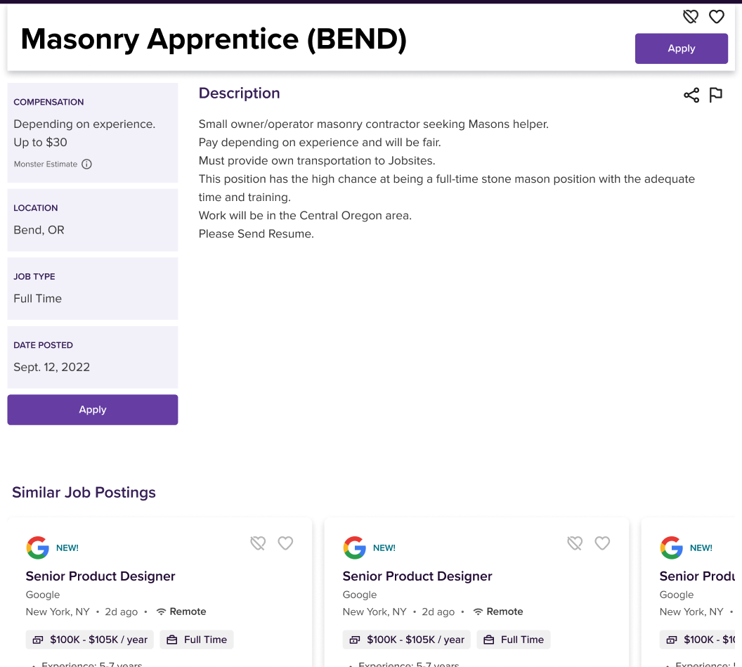
Example of our bloated Button inventory

With the website inventory complete, our next strategic move was to take stock of our existing Figma components and thoroughly understand their construction. We dove into the intricacies, examining ways to optimize Figma features and refine styles such as color tokens and font styles. Additionally, we meticulously checked for sync with our existing Storybook components, ensuring a seamless alignment of states and functions. This process aimed to streamline prototyping, empowering designers to create using existing components from our library and ensuring a faster build process. By maximizing the potential of our design system, we fostered seamless collaboration and efficiency, enabling us to deliver exceptional digital experiences with unprecedented speed and precision.


Taking action

Now that the groundwork was laid, the real work began. We meticulously broke down each component or pattern into a Jira ticket, incorporating all the documentation we had gathered. Collaboratively, we crafted a streamlined workflow process to ensure a seamless and efficient development journey. Working remotely presents its unique challenges, and I've discovered that defining the flow early on is paramount. By setting benchmarks and guidelines, we proactively kept the process on track, allowing for smooth and productive progress throughout the project. This approach not only fostered cohesion within the team but also ensured that our design system and development efforts aligned harmoniously, resulting in exceptional digital experiences for our users.

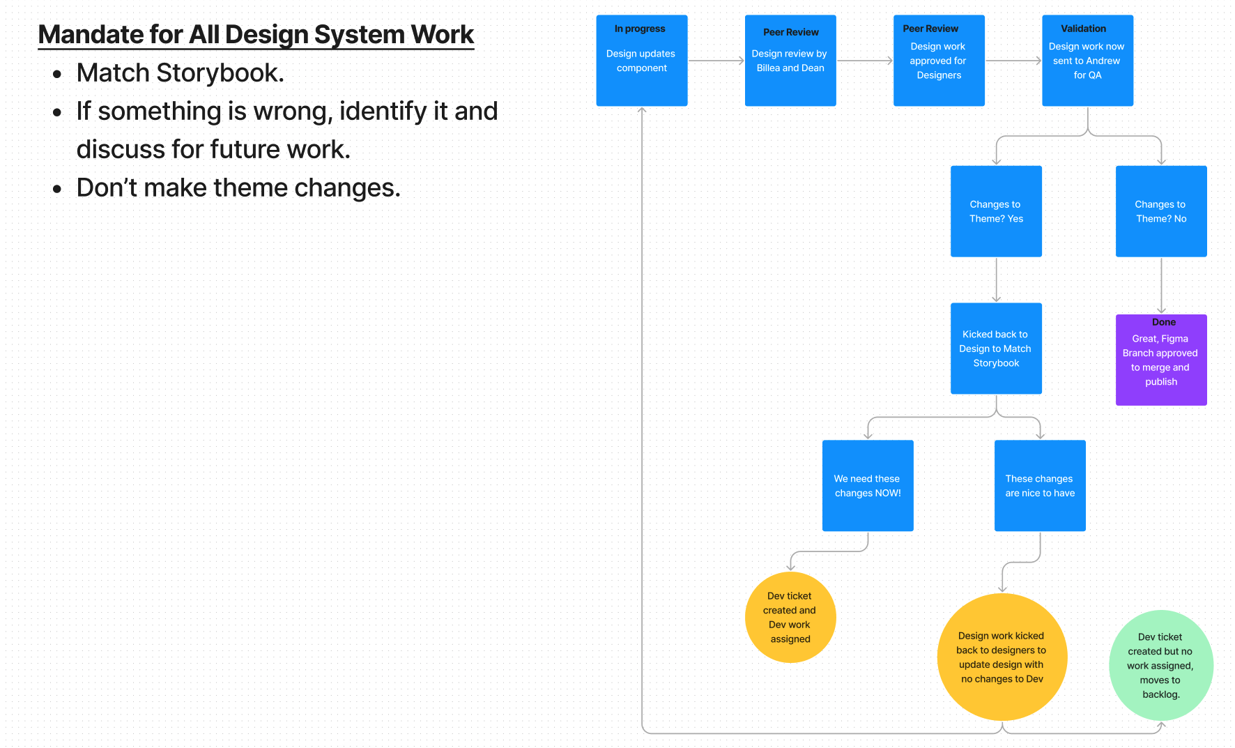
The way we kept our focus in sync

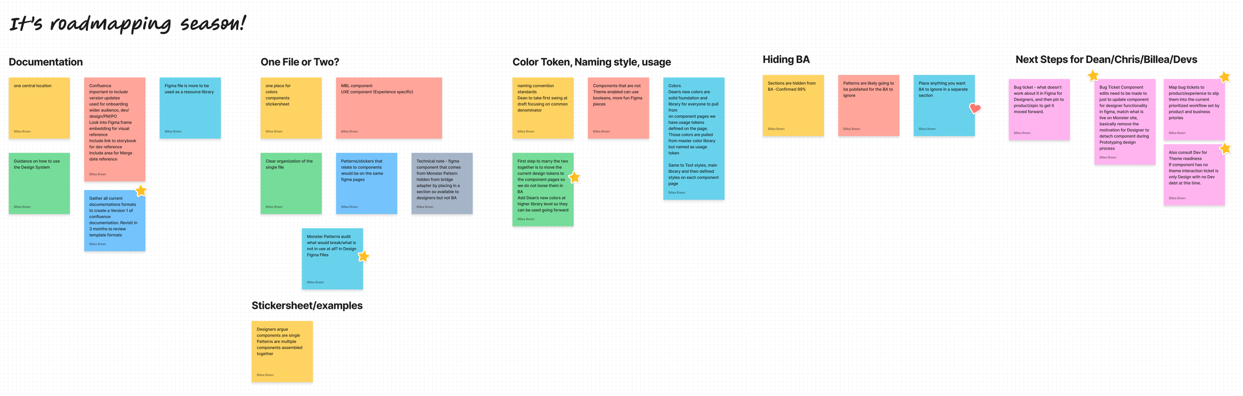
Questioning our current process and looking for new Best Practices as we update our Design System


Current Status

Switch component

As we approach the final stages of our design work in Figma, we are thrilled to be 70% done and moving steadily towards our goal. Currently, we are diligently scoping out the necessary steps to actively involve our Developers in updating our components. The next crucial stage involves addressing design bloat, optimizing accessibility states, and resolving any outstanding issues. We are committed to refining the theme output, ensuring a cohesive and polished user experience across all touchpoints. By collaborating closely with our development counterparts, we aim to achieve a seamless integration of design and development efforts, delivering an unparalleled digital experience that exceeds expectations. With our collective efforts and dedication, we are poised to unveil a design system that showcases the true essence of innovation and excellence.


Updating Job View

As part of my first project, I led the redesign of our main product, the job view listing, to accommodate multiple languages and custom designs. By introducing innovative solutions, we enhanced the platform to cater to various companies' unique needs, offering them a premium experience that sets their job listings apart.

Project Scope

TWhen faced with the task of updating our job view, I encountered a significant challenge: accommodating a diverse range of job postings, each with varying amounts of data, including images and videos. Some listings were content-rich, requiring efficient handling of multimedia elements, while others consisted of scanty text and poorly formatted information. To address this, I embarked on a meticulous design process, ensuring that the job view could seamlessly adapt to different content types.

My solution involved crafting a flexible layout that intelligently displayed multimedia content when available, while still maintaining an aesthetically pleasing and coherent presentation for listings with minimal text. Through a user-centric approach, I focused on enhancing the browsing experience, enabling job seekers to easily navigate through the listings and access essential information. The result was a versatile and visually engaging job view that accommodated a wide array of job postings, catering to the unique needs of both employers and job seekers alike.


Where to start

To kickstart the process of updating our digital platform, I embarked on a thorough exploration of the existing system. The first steps involved taking a comprehensive inventory of all components, meticulously documenting each element, from UI elements to interactive modules. Simultaneously, I reviewed current designs and content to assess areas that required improvement and optimization.

Collaborating closely with our talented team of developers, I proactively engaged with them to understand the Data Lake sources and how they would be retrieving information to render into the design. This critical step ensured a seamless integration between the backend and frontend, ultimately enhancing the overall user experience.

Moreover, I recognized the significance of consulting with our SEO experts to ensure that the updates wouldn't negatively impact our website's search engine rankings and traffic. By considering SEO requirements throughout the design process, we ensured that the platform's visibility and accessibility were maintained and improved.

Original “Simple” Job Posting

Original sponsored Job Posting


Round 1 - Design Options

With all the essential "ingredients" in place, it was time to embark on the exciting journey of designing the platform. I carefully considered current design trends, our brand's unique styling, and ways to distinguish ourselves from competitors, ensuring a fresh and captivating user interface. My focus was to strike the perfect balance between creativity and cohesiveness, maintaining a consistent layout throughout while exploring innovative ways to infuse visual appeal and user engagement.

One of the key challenges was to create a seamless experience for users while accommodating sponsored job postings that provided added value. I ingeniously designed a solution that allowed sponsored jobs to stand out without disrupting the overall user experience. By thoughtfully integrating these features, I ensured that the platform remained user-centric, providing relevant and engaging content while offering a clear distinction between standard and sponsored job listings.


User Testing

Now that the designs were ready, it was time for a crucial step – user testing. The selected designs that resonated well with the product owner underwent rigorous testing with real users to validate their effectiveness and usability. This iterative process allowed us to gather invaluable feedback, ensuring that the final design would genuinely cater to our users' needs and preferences. By incorporating insights from user testing, we honed the designs further, ensuring a polished and user-approved product.

In our Mobile tests, 97% of participants found that version 2 (Accordion) was easier to navigate because the information was clearly labeled and required little to no thought. Version1 (Tabs) required a bit more thought in terms of navigation and the need to decipher which tab contained which information. When it came to Desktop though 86% of participants responded that version1 (tabs) was easier to navigate. Participants favored the tabs at the top of the page because they felt familiar and found them more easily accessible, while also giving a cleaner look and feel to the page.

I thought I wanted everything about the job on one page without clicking around to find a section, but upon reflection, I like that I can easily find the different sections of the listing with a click. I usually use Indeed to search for jobs where they list everything in one page and I find that sometimes it is not as easy to jump to qualifications and this removes that hunting around aspect.” -P12

“I think version 1 is easier to navigate. This is probably due to the fact that the different tabs are more neatly arranged.” -P2

“I consider that both of them were equally easy. However, I believe that Version 1 felt more familiar to me because of how the tabs are displayed/organized.” -P14
— Usertesting.com Via UX Researcher
 
Version 2 was easiest because I did not need to guess what the icons are for it was very clearly labeled.” -P2

“For me, it was number 2. There was no ambiguity over the icons at the bottom; it was very easy to tell for version 2 what section contained the pertinent information.” -P10

“I found number two to be the easier to navigate as I did not discover the icons at the bottom of version one easily even despite multiple attempts to scroll down.” -P14
— Usertesting.com Via UX Researcher

MVP Version

After receiving the user testing results, we carefully analyzed the feedback and identified areas of improvement for our product. This valuable user input allowed us to pivot our approach and focus on addressing the pain points that were revealed during testing. With a renewed sense of purpose and direction, we iterated and refined our design, making necessary adjustments and enhancements. The result of this rigorous process was the development of our final MVP (Minimum Viable Product). By incorporating user feedback and streamlining the user experience, we are confident that our final MVP will better meet the needs and expectations of our target audience. We are excited to launch this refined version and continue to gather feedback to further enhance and evolve our product.

My favorite Developer recently published his work that we did together on the MVP of Designs. As they started to come to light we found an interesting problem and he presented solutions in the most collaborative way.


FinTech Work

I worked at Apexon, a consulting company that embedded me at our client Trepp, a leading provider of Finance information and analytics, working on products related to services to the Structured Finance, CRE, and Banking markets.


My work

During my time at Trepp in NYC, I had the privilege of being part of a small, dedicated team of UX Designers. As a newcomer to the world of Fintech, I approached my work with a solid foundation of design principles and a genuine eagerness to listen to the users, understanding that my knowledge deficit could actually serve as an asset rather than a hindrance. This mindset allowed me to embrace new challenges with enthusiasm, and I quickly found my place in the dynamic landscape of real estate banking.

Within the realm of data tables and data visualization projects, I discovered the immense significance of comprehensive reports in the banking industry. Collaborating closely with a large team of developers, we embarked on a journey to streamline the handoff process and maximize sprint efficiency. Our collective efforts led to the creation and growth of our own Design System, empowering us to deliver consistent and exceptional user experiences while fostering seamless collaboration across the teams.

As my tenure progressed, my familiarity with Banking terms expanded, and I found myself comfortably utilizing industry-specific acronyms. Although not yet a mogul in the field, my dedication to continuous improvement fueled my drive to be the best UX designer possible. With every project, I strove to push the boundaries of design innovation, contributing to meaningful solutions that resonated with both users and stakeholders alike.


Climate Dashboard

As the UX Lead for Trepp's time-sensitive project, our primary objective was to create a captivating and engaging way to showcase environmental risks associated with properties, just in time for their prestigious annual conference, CREFC in Miami. To meet this challenge, we adopted a unique workflow, collaborating closely with the product manager from the outset to brainstorm ideas and establish the desired appearance and functionalities.

During the design process, we encountered a crucial question: How can we differentiate the maps while ensuring they remain appealing and familiar to our users? Seeking inspiration from unexpected sources, we turned to the Project Lead's favorite video game, which provided a fresh perspective and ignited a creative spark. This approach reminded us to consider users as holistic individuals, encompassing not just their interactions with screens but also their interests, preferences, and emotions.

By combining data-driven insights with creative ingenuity, we successfully crafted an intuitive and user-centric data visualization, ensuring that the presented information would not only be informative but also captivating and enjoyable for conference attendees. Embracing this holistic approach allowed us to exceed expectations and create an unforgettable experience at CREFC in Miami.

Technical note: Designed in Figma, in current production expected to be completed in the next 3 Sprints


Deal Snapshot

The project aimed to address the issue of slowed workflow on the main Deal List page, with the goal of offering the total amount of data while staying on the list screen. Our UX solution involved implementing a sliding panel to display specific deal data. Collaboration between developers and design played a key role throughout the process. We conducted multiple spikes, with developers reviewing and testing functions based on lo-fi wireframes while we refined the panel design. Iterative drafts led to a realization that vertical data presentation limited the panel's space, prompting us to move summary points to a column and create more workspace for charts and tables. Utilizing the Agile method, the team effectively maximized time and workflow, ultimately achieving our desired outcome.

Technical note: Designed in Axure, currently broken into multiple Epics that are being developed during a migration from Bootstrap to React.


Design System

During my time at Trepp, I had the exciting opportunity to be part of the early stages of developing our Design System. Collaborating closely with our Front-end UI Lead, we embarked on the journey of building the bike as we rode it, laying the foundation for a robust and cohesive system. Although I eventually found a new job opportunity, I'm more than happy to discuss the initial steps we took and the ambitious goals we set for the project. If you'd like to learn more about our workflow, designs, and redlining, feel free to reach out, and I'd be delighted to share the insights and progress we made during that transformative phase.


Compassion

Compassion is a platform where someone with means can donate directly to someone without means which they pass on the street. There is a growing base for social good most people don’t know where to start. The app is as fast and easy as pulling a dollar from your wallet.

I was part of a small team alongside with Unice Arce and Morgan Princiotta. My role was Team Lead, where I was responsible for research, front‑end development, and interaction design.

Problem to solve

How can we make donating an essential good to someone in need as simple as giving a dollar from your wallet?

How can we make donating an essential good to someone in need as simple as giving a dollar from your wallet?

Homelessness in New York City has reached the highest levels since the Great Depression of the 1930s. Each night thousands of unsheltered homeless people sleep on New York City streets, in the subway system, and other public spaces. There is no accurate measurement of New York City’s unsheltered homeless population, and recent City surveys significantly underestimate the number of vulnerable homeless New Yorkers. While there are shelters and people donate money on the street, there are plenty of basic needs that homeless people are still missing.


Concept research

Solution needs to be mobile
Americans spent almost $400 billion online in 2016, and nearly half of that happened on a mobile device. According to the Online Fundraising Scorecard from Dunham+Company, 84% of nonprofits didn’t optimize their donation experience for a smartphone or tablet.

Items to donate.
The data pointed to hygiene items mostly and more basic food items, mostly shelf stable. We can offer them via different groupings and different price points. The prepared kits will cut down on decisions and items can be ready to deliver at a moments notice. Also a general donation should be available as well.

And don’t forget…

Make it simple.

What do you prefer to donate?

#1 reason for giving money was convenience


User Research - Buyers

We needed to understand the process of someone donating to a homeless person in need. We needed to understand the motivation, pain points, and comfort levels of users.

Do you prefer to give money or food/goods to someone in need? Have you ever gone to the store to purchase something specific that someone asked for? Why?  

Yesenia: I prefer to give food/goods. I have purchased food for a family in need after they asked for help as I walked past them. I asked if they would like something to eat and when they said yes, I came back with some food.

Does donating to a homeless person or panhandler make you feel anxious or uncomfortable? Is there a way to ease that discomfort/anxiety?  

Cecile: yes it does. I wish I were a better person, but it feels like an infringement of my personal space. Also, I know it's a horrible stigma, but not knowing what they'll use the money for is a huge deterrent. That's why it's easier for me to donate to people I've seen around my neighborhood. I get a better sense of who they are and want to help them. Possibly a profile or backstory on the person would do a lot to humanize them.


User Research - RECEIVERS

There are also the end recipients to consider. We had to be sure that the goods and service that this app would provide to the homeless population would be received positively.

Homeless research.png

I spoke to three men near Time Square, each of them I gave a small travel kit, along with a bottle of water and a KIND bar.

Greg: Water is great, backpacks or those cloth shopping bags

Sam: Someone gave me a toothbrush once, that was nice. I’d love one of those phone battery packs. (he waved an old iPhone at me)

Mike: Aside from money, band-aids could come in handy. I get blisters really bad

John, I found near the Staten Island Ferry, he was very friendly and soft-spoken.

John: Honestly anything you can give would be great. (He was sleeping on cardboard boxes so I offered one of those travel pillows and he like that idea a lot. I ran into Duane Reade and got him one)


Sample User Journey

DEREK

“I try to give when I can”
Demographics
Age: 23
Location: Brooklyn
Job: Copywriter/Music Blogger
Salary: $ 40,000/year
Family: Single
Education: BA in English
Technology skills: Computer proficient, PC user, iPhone mobile device

About Derek
New York transplant from Ohio, he’s focused on making friends and having a good time. His priorities are, paying rent, good music, and friends to share it with. Since he moved to NY about 3 years ago, he’s still learning the city and likes to explore. He’s glued to his phone more than he’d like to admit, he is constantly posting to instagram or Snapchat.

Pain Points

  • Not aware of his surroundings, he often doesn’t notice
    homeless people unless they’re in front of him.

  • He needs prompting to donate; it’s not a common task.

Mental Model - Derek - Click to see his full journey


Branding

When considering the branding for this project we looked to our motivation to influence our name. As there are delivery and location elements to the product, we explored words like delivery, local, distribution, and donate. We settled on compassion as it contained the word compass, giving us the location elements we needed.

The logo was created by using two location pins and combining them into a heart shape.

For colors and font, our aim was something gender neutral and approachable.


Prototype - Evolution

Version One

In the first draft, we explored the idea of horizontal and vertical swiping. Allowing users to shop by three categories, premade care kits, kits by cost and individual items, this was in response to some research that suggested it would be easiest to purchase items at a dollar amount.

Our research also showed that some users would want to buy one off items or create a custom care package.

Version Two

With version one prototype, user testing showed two versions of swiping was confusing. Also, the button size was too small for many users and having three categories was not necessary for the user. Feedback from Usertesting.com suggested that we limit the home screen to two groups, kits, and individual items.

Version Three

After another round of user testing, we adjusted the item size going back to our first idea of square icons, which allowed us to fit more items on the page as well. We wanted to include space to promote specific kits, such as seasonal items or if we had sponsors that area will be ad space.

In future versions we would like to explore the options for Force Touch for quick adding to the cart, and recently purchased item prompts as well.


Disney AR Experience

Using AR (Augmented Reality) technology to prototype two add-on features for an existing app that Disney just launched for their parks.

 
Image from Disney Blog

Image from Disney Blog

Current App

PLAY is an app that Disney launched Summer of 2018 to keep visitors more immersed in the parks without putting down their phones. The app currently offers trivia games and playlists that can be accessed at any time, in or outside the park. The location-based games are meant to be played while visitors are waiting in line for rides with consistent long lines. The games use elements shown in the line to keep the visitor engaged in their surroundings while still moving along the line.


Suggested new Features

Disney has always promoted the idea of Magic all around us. With the advancements in AR technology, we can now add a little Magic to our world. Inspired by movies, Mary Poppins, Pete’s Dragon, and Bedknobs & Broomsticks, I looked for a way to provide users with an infusion of animation their surroundings. The same way Mary Poppins jumps into the drawing with the kids or Elliot befriends a lonely Pete; users can use their phone to activate the magic around the park.

Face Masks or Face Filters  

Using Facebook’s AR Spark Studio and Photoshop I was able to bring my ideas for Face Filter masks to life.


AR Scavenger Hunt

Using Facebook’s Spark AR studio, and 3D designs from Sketchfab, I was able to create a scavenger hunt based on the statues found in Disneyland and California Adventure Park.


Facemask process

Photoshop

These vector face came from Josue Gil from the Noun Project

To create a face filter, first I needed the filter image. I used to The Noun Project for this task as their site has some great vectors to utilize. Once I decided on my faces; I downloaded the files and began to edit them in Photoshop.

Using the tutorial file provided from Facebook Moustache.png as a guide of how large elements of my mask need to be, I began to scale out my vector. Goofy was the first mask created and the most complicated. The Goofy vector was simple, but I knew from previous projects I would have to separate out his hat, ears, and face all into four different layers to create the effect I required.


Trial and Error

With my layers created it was now time to save them as .PNGs to check my work. Mapping to a face is not an exact science, and it requires a healthy amount of trial and error to get it just right. My first attempt of the Goofy face didn’t stretch to the hairline, ruining the illusions. The second try it wasn’t wide enough, back to the drawing board. I went through multiple versions of each layer working to find the right fit.


Spark AR Studios

I expected working with Spark AR Studios to be very complicated and require more knowledge of coding that I possessed. I was happy to discover after walking through the tutorial a few time it’s not much harder than adjusting an image to just the right fit. I tested each material I created and moved them to the right spot on the model faces. Facebook provides a diverse group of face models for projects which allow for testing of designs.

At first, I allowed a user’s eyes to show through the design, but the effect ruined the illusion of a cartoon character. I found it better to keep them cartoon white and only allow for the mouth to show through when opened. Overall I was pleased with the effect.


Scavenger Hunt Process

Sketchfab & Photoshop

When it came time to create the scavenger hunt I wanted to keep with the theme of reality/animated movies. Adding a 3D character to existing hotspots in Disneyland would be the goal, but first, the 3D characters were needed. Sketchfab is a comprehensive site for a variety of 3D elements; the files are also compatible with Spark AR Studios. I wanted a classic character for Disneyland and a newer character for California Land. In both parks, the statues of Walt and Mickey are iconic. I used pictures found with a google search to capture the statues. Once I had a straightforward view of the statues I isolated them in Photoshop to create a trigger image.


Spark AR Studios

In Spark AR Studios you can create a Plane Tracker which activates once the camera detects a flat surface. I wanted to take that a step forward and activate the 3D effect when the camera recognized a specific image. The isolated the statue images in the previous steps now could be used for trigger images. With this element established I just needed to adjust the 3D item to show up on the same plane as the statue. Again with simple image adjusting until I had the desired result. I tested my effect on several statue pictures and had mostly positive effects. Since I'm in New York, not California I'll have to wait for my next Disney trip to try this out in person; but I'm confident it would work.


Prototype

This is walkthrough of the app with based off the existing screen. I highlighted the new features and built the screens to mimic existing content. The effects are static because they are only previewable from the Facebook AR Studio application.


JetBlue Feature

A design sprint over 4 hours to create a feature for an actual application. Using an existing design system to improve the overall appearance and function of the app as well.


Concept

This feature provides users of the JetBlue travel app the ability to save a flight path and days of a trip, to refer back to when they wish to check prices or use as a booking shortcut. In its current state, to book a flight the user is required to enter a start point, end point, dates of travel requested, and finally passengers. With saved searches, a user can easily refer to a route they often use and save steps in the booking process. Saved searches also allow for more filters so a user can refine their search even further. These filters make the save search feature a price tracker as well. With this feature, it's even easier to plan an impromptu trip to Nashville or a three day weekend to visit family.


Concept Process

I was inspired to create this feature as my parents live in Florida and keeping track of flight sales can be time-consuming. I would love to quickly check an app every month or two when I want to book a quick flight.

I quickly mapped out the search functions I would need, along with filters that I would like to use. Once I refined those elements; I walked through a quick user journey to confirm my concept.

jetblue-pot-it.png

Design System

JetBlueDesign System.png

Salesforce has one of the most robust Design Systems on the market. I started with their system as the building blocks of the look and feel I wanted to pivot toward with JetBlue. The number of filters and search functions I wanted to provide was a perfect match with the buttons and symbols that the Lighting Design System contains.


Hi-fidelity Screens

JetBlue - Artboard 1.png

Screen Highlight One

JetBlue - Artboard 2.png

Screen Highlight Two


HexHacks18 - Chat with a Coach

HexHacks18 was a hackathon hosted by Hexagon NY at Frog design studio. It was a design jam event focused on bringing our minds together to create solutions that can promote underrepresented communities in tech and uplift our community of women and non-binary individuals!

I was part of a team I met that day for the 10hour hackathon. My role was Team Lead, where I was responsible for research, managing our project in such a tight time frame, and ultimately presenting it to the judges.

HexagonPresentation.jpg

Challenge

Problem

Women in tech face different challenges from other industries due to the nature of a predominantly male-dominated culture. Navigating these challenges for the first or fifteenth time can be difficult without resources. Finding a mentor at a job or even a sounding board for work issues can be hard for some women.

Solution

A mobile app that provides coaching to help women gain the tools and resources necessary to obtain equality in the workplace. The main component of the app would be a chat function where users could reach out with a problem they are struggling with and receive real-time feedback on how to tackle the issue.


How does it work

Based on the issue that brings you to the service we will match you to a business coach who can help you improve through a personally curated toolbox of solutions that go beyond a simple conversation.

Supplemental elements will include:

  • Articles and videos

  • Goal setting

  • Skill building on an issue area

  • Checklist for action items

  • Peer group forum

UserFlow

Concept research

Current in the marketplace
There are current chat counselor services that exist, but they are more for overall mental health. Talkspace one of the leaders in the industry with an easy to use application and reasonable prices. Their services are price tiered based on the amount of communication you need, chat only, voice chats, video chat. Their focus is on communication in any form.

Why are we different?
Our service would take this idea of communicating digitally with a coach or mentor and add follow up goals and additional resources. Talking about an issue is great, but if users know there is a level of accountability with the problems they need advice, they become more invested in the process. The service moves from just a place to vent an issue to a place to solve a problem.

Accountability and Resources, that why we stand out.

Talkspace

Scenario - Persona

Linda

Demographics
Age: 28
Location: New York City lives in Brooklyn
Job: Multiple hats in Start up
Education: BA in Communications

  • Tech savvy

  • 4 years of professional

  • iPhone user

“I want to talk to my boss about not working extra hours on weekends.”

Lifestyle

She works at a startup wearing many hats, she is the newest person to join the team. Her boss is demanding, and she often works extra hours. She is afraid of her boss; they don’t have a comfortable working relationship. She’s more a passive person, preferring to avoid conflict rather than initiate it

Pain Points

  • Lack of knowledge of resources for career advice

  • She has no role model within her company

  • Her group of friends have limited experiences with conflicts

Motivations

  • Work life balance

  • Promotion, career growth $$

  • Making a positive impact at work

Scenario Linda finds herself in…

Linda, an overworked employee at a startup who wants to talk with her boss about no longer working extra hours on weekends. She isn’t sure who to talk to at work about her problem since she is new to the team and doesn’t want to upset the environment. She also is the only woman on her team and there aren’t other women in leadership roles at her company she can look to for leadership.

She goes to the platform to find a coach to help her with this problem. Her coach listens to her issues and gives her some goals to improve her confidence. A week later the coach prompts Linda to see how things went with talking to her boss and if her situation has improved. She also recommends Linda completes the skill-building exercises.


Impact

The users helped by the service defines success — the users who have accomplished their goals and gained personal skills to improve their work-life count as victories.

This platform works to grow the soft skills of users and offer resources for personal and professional improvement. By giving women a safe space to discuss problems, they are facing at work with mentors who hold them accountable perhaps the next time they face a struggle they will have the tools and confidence to tackle that challenge.


Prototype - Issue Screen

After the Hackathon I developed out our sketches into more High Fidelity screen.

FIrst Draft.png

Version One

One of the screens we developed during the hackathon was the screen to start the discussion. We presented bubbles of current issues most women face as a way to start the conversation. We wanted it a simple welcoming screen.

Second Draft.png

Version Two

Taking the paper and pen ideas into Sketch, I used the Apple UI Kit for simple fonts and a clean look. There had been a discussion of abstract bubbles, but for a rough prototype test, I keep the conversation topics simple. The idea behind this version was to test the concept feel on your phone in your hand.

Third Draft.png

Version Three

With my low fidelity screen, I was able to test the concept of this screen with other users in the Hexagon Community. While they liked the general idea, feedback was that the topics were too "Big Idea" and some users may not be sure what category that addressed their problem. This version removes the bubbles and shows users examples of issues that others are discussing to encourage anyone's engagement.


Project Navi

Tour Guide App - Feel like a local when visiting a new city

Travel app.jpeg

What is Navi?

A crowd-sourced site that allows users to build or follow tours of any city. The mobile app is a tour guide in your pocket. Tours can be shared and collaborated with multiple users. A desktop site for more expanded detail planning.


Objectives & Requirements

Business objectives  
To offer a platform for small businesses to promote themselves. Promote a greater cultural understanding of visitors through shared experiences. Use technology to show that even when we walk alone in a new city, we are not alone in our exploration. Revenue will be generated from business paying for preferred listings, selling user data, premium user memberships. A marketing plan will need to emphasize reviews from Navi. There needs to be a draw for business to earn a review or a spot on someone’s created tour.

User objectives
Gain a more insider experience during a visit to a new city. Learn more locations to visit, see a city from a different perspective.

Technology needs
Photos and reviews from existing content forms such as Yelp or Instagram. Both have API that can be used to build this platform.


Process of Development

Initial hypothesis of user needs - Clear, reviewed, verified locations that comprise a tour/experience of a city. The tours should include travel duration and tips on how to optimize the journey. Users need to be able to trust that the tour they selected, and that it will not provide them with a negative experience. The tours or tour guides will need to be verified to establish user trust. Photos and written expectations of the route and locations along the tour should be included for the user to base their decision.


User Research Results

I interviewed 7 potential user ranging in age from 22-41. Their responses were able to help reshape my initial hypothesis and give me feedback on potential features of the application.

When visiting a city, most users looking for:

  • Non-tourist locations

  • Local flair

  • Good restaurants (defined by local hang out not culinary award winning)

  • Historical Locations

Tools users use for travel research: (by popularity)

  • Google, travel websites (tripadvisor, travel blogs)

  • Social media (instagram, facebook)

  • In person recommendations from friends/family/coworkers

Defining a Local -1-3 Years of living in a location to be established

Opinions regarding Post Tour Survey:
“If it was easy like the Lyft review form I would fill it out”
“Nope, I don’t see the benefit for me”


Wireframes

When building screens for testing I focused on using the search function to find a tour. Once the tour is selected, the app provides navigation, and the user can review quick tips left by locals at each venue. Then they can choose to visit each location in sequence or skip places if they aren't interested. Once the tour is completed, a review promps the user for feedback.