Updating Job View
As part of my first project, I led the redesign of our main product, the job view listing, to accommodate multiple languages and custom designs. By introducing innovative solutions, we enhanced the platform to cater to various companies' unique needs, offering them a premium experience that sets their job listings apart.
Project Scope
TWhen faced with the task of updating our job view, I encountered a significant challenge: accommodating a diverse range of job postings, each with varying amounts of data, including images and videos. Some listings were content-rich, requiring efficient handling of multimedia elements, while others consisted of scanty text and poorly formatted information. To address this, I embarked on a meticulous design process, ensuring that the job view could seamlessly adapt to different content types.
My solution involved crafting a flexible layout that intelligently displayed multimedia content when available, while still maintaining an aesthetically pleasing and coherent presentation for listings with minimal text. Through a user-centric approach, I focused on enhancing the browsing experience, enabling job seekers to easily navigate through the listings and access essential information. The result was a versatile and visually engaging job view that accommodated a wide array of job postings, catering to the unique needs of both employers and job seekers alike.

Where to start
To kickstart the process of updating our digital platform, I embarked on a thorough exploration of the existing system. The first steps involved taking a comprehensive inventory of all components, meticulously documenting each element, from UI elements to interactive modules. Simultaneously, I reviewed current designs and content to assess areas that required improvement and optimization.
Collaborating closely with our talented team of developers, I proactively engaged with them to understand the Data Lake sources and how they would be retrieving information to render into the design. This critical step ensured a seamless integration between the backend and frontend, ultimately enhancing the overall user experience.
Moreover, I recognized the significance of consulting with our SEO experts to ensure that the updates wouldn't negatively impact our website's search engine rankings and traffic. By considering SEO requirements throughout the design process, we ensured that the platform's visibility and accessibility were maintained and improved.
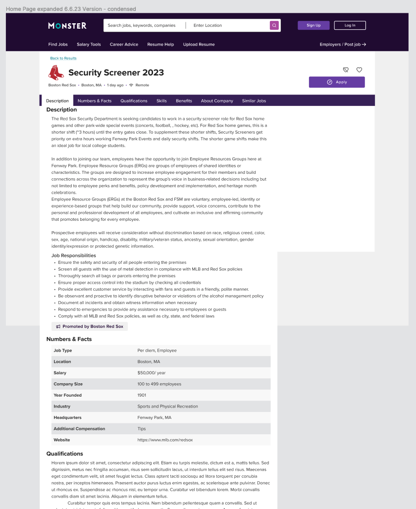
Original “Simple” Job Posting
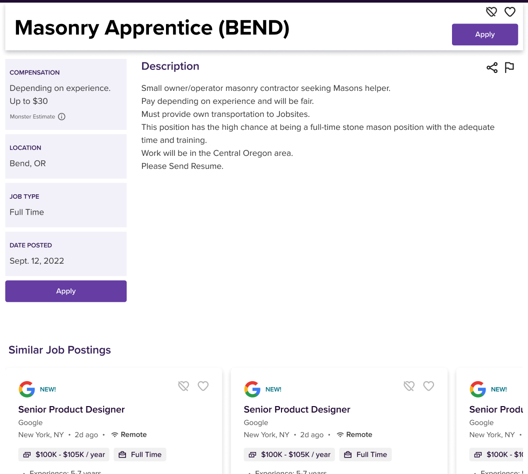
Original sponsored Job Posting
Round 1 - Design Options


With all the essential "ingredients" in place, it was time to embark on the exciting journey of designing the platform. I carefully considered current design trends, our brand's unique styling, and ways to distinguish ourselves from competitors, ensuring a fresh and captivating user interface. My focus was to strike the perfect balance between creativity and cohesiveness, maintaining a consistent layout throughout while exploring innovative ways to infuse visual appeal and user engagement.
One of the key challenges was to create a seamless experience for users while accommodating sponsored job postings that provided added value. I ingeniously designed a solution that allowed sponsored jobs to stand out without disrupting the overall user experience. By thoughtfully integrating these features, I ensured that the platform remained user-centric, providing relevant and engaging content while offering a clear distinction between standard and sponsored job listings.
User Testing
Now that the designs were ready, it was time for a crucial step – user testing. The selected designs that resonated well with the product owner underwent rigorous testing with real users to validate their effectiveness and usability. This iterative process allowed us to gather invaluable feedback, ensuring that the final design would genuinely cater to our users' needs and preferences. By incorporating insights from user testing, we honed the designs further, ensuring a polished and user-approved product.
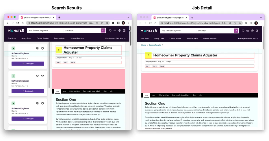
In our Mobile tests, 97% of participants found that version 2 (Accordion) was easier to navigate because the information was clearly labeled and required little to no thought. Version1 (Tabs) required a bit more thought in terms of navigation and the need to decipher which tab contained which information. When it came to Desktop though 86% of participants responded that version1 (tabs) was easier to navigate. Participants favored the tabs at the top of the page because they felt familiar and found them more easily accessible, while also giving a cleaner look and feel to the page.
“I thought I wanted everything about the job on one page without clicking around to find a section, but upon reflection, I like that I can easily find the different sections of the listing with a click. I usually use Indeed to search for jobs where they list everything in one page and I find that sometimes it is not as easy to jump to qualifications and this removes that hunting around aspect.” -P12
“I think version 1 is easier to navigate. This is probably due to the fact that the different tabs are more neatly arranged.” -P2
“I consider that both of them were equally easy. However, I believe that Version 1 felt more familiar to me because of how the tabs are displayed/organized.” -P14”
“Version 2 was easiest because I did not need to guess what the icons are for it was very clearly labeled.” -P2
“For me, it was number 2. There was no ambiguity over the icons at the bottom; it was very easy to tell for version 2 what section contained the pertinent information.” -P10
“I found number two to be the easier to navigate as I did not discover the icons at the bottom of version one easily even despite multiple attempts to scroll down.” -P14”
MVP Version
After receiving the user testing results, we carefully analyzed the feedback and identified areas of improvement for our product. This valuable user input allowed us to pivot our approach and focus on addressing the pain points that were revealed during testing. With a renewed sense of purpose and direction, we iterated and refined our design, making necessary adjustments and enhancements. The result of this rigorous process was the development of our final MVP (Minimum Viable Product). By incorporating user feedback and streamlining the user experience, we are confident that our final MVP will better meet the needs and expectations of our target audience. We are excited to launch this refined version and continue to gather feedback to further enhance and evolve our product.
My favorite Developer recently published his work that we did together on the MVP of Designs. As they started to come to light we found an interesting problem and he presented solutions in the most collaborative way.